Park&Stone
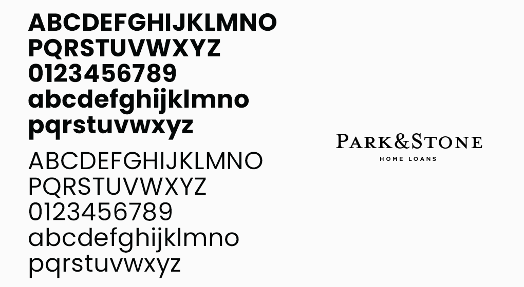
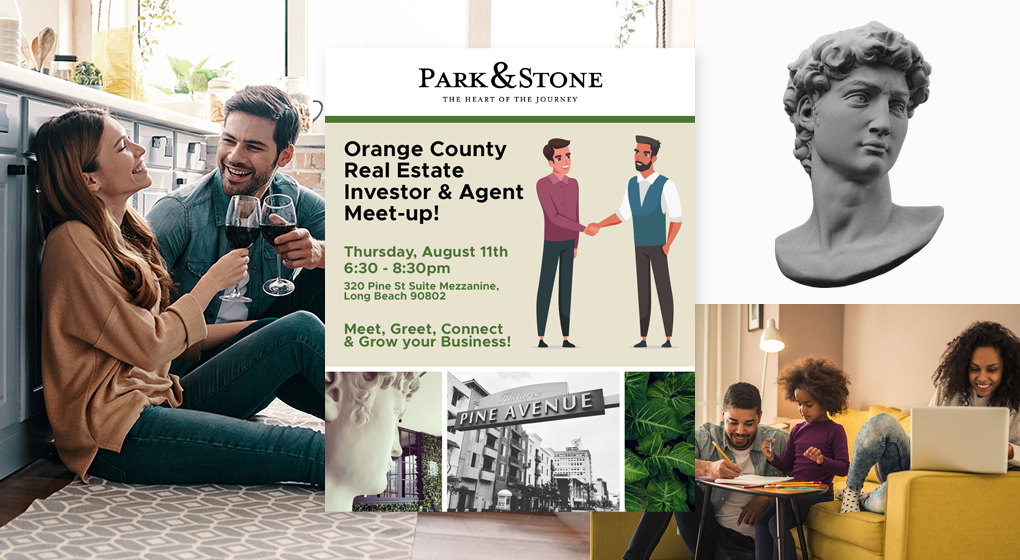
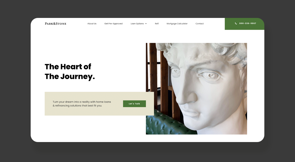
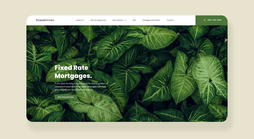
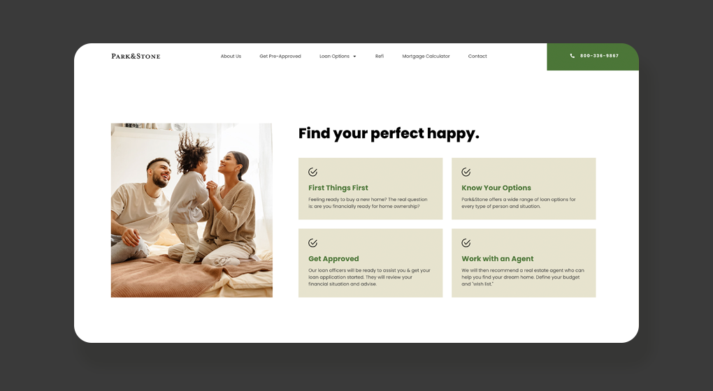
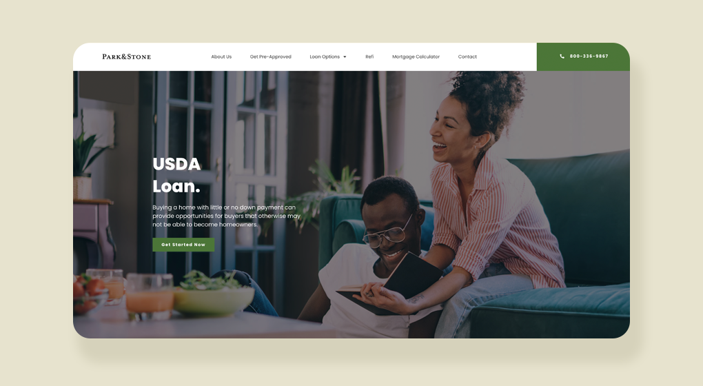
We worked with the founder of Park&Stone to build & design their first ever public facing website. We refined their branding assets; discovered their vision and went to work to create a “tattoo parlor meets old school “detectives office” vibe. Using big visuals and a simple color palette—breaking away from your traditional lending office and bringing it well into the 21st Century.

